BOBA GUYS
Microinteractions
Microinteractions are elements that have one are found in applications. Their objective is to add value to an image and please the consumer by creating an engaging, welcoming, and human moment. Microinteractions communicate their status by providing feedback through direct manipulation of the element and allows consumers to see the results of their actions.
Role:
UI/UX Design + Motion Graphics
Duration:
8 Weeks
Software:
Figma, Adobe Illustrator + After Effects
PDF | Preview Avaliable | 13MB | 31 pages
GOAL
Create microexpressions for a touch screen kiosk that reflects on the brand.
1. Button
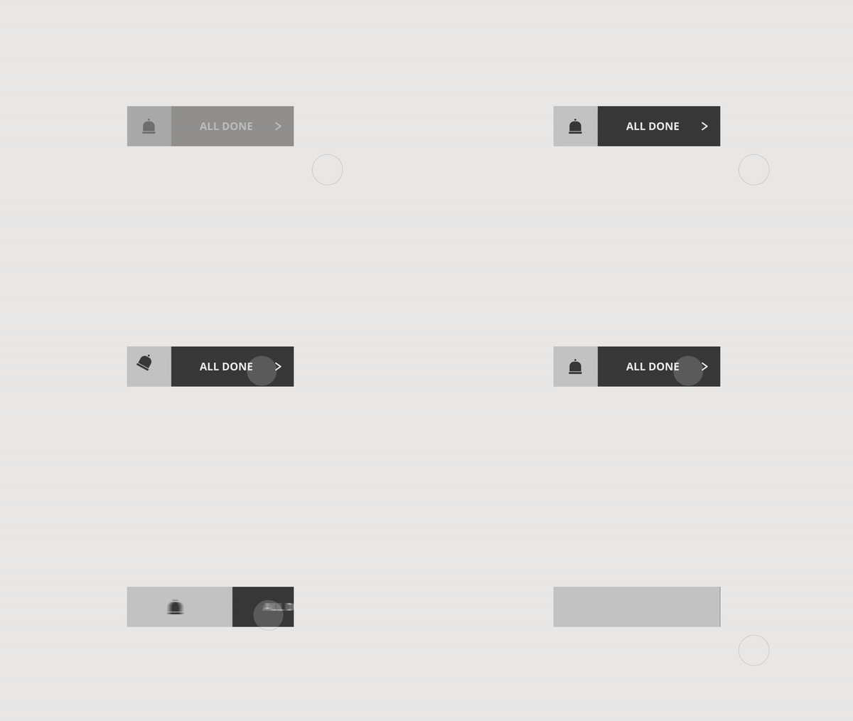
The button is the main element of the experience. Positive feedback is essential. The user needs to know that they actually clicked it and that the system has received the message.
2. Multi Toggle
Goes beyond a basic binary choice to three or more options. There’s still no in-between. The control is indexed
3. Radio Buttons
User selects from multiple choices but only one item can be selected. If the user selects a second item, the first is automatically deselected.
4. Checkboxes
Multiple choices and multiple items can be selected. Users may click an item a second time to deselect it. Sometimes, the user can select only a specific number of items.
3. Menu
Display a top-level menu. A short list of text labels with or without icons. Expand a sub-menu from a sub-category. Provide an affordance so the user understands that a deeper list of options will be provided from some or each of the top-level labels.
6. Loading
Loading indicators use data from the system to present the user with an ongoing indication of progress regarding completing a process. The wait indicator provides only a vague suggestion of feedback that the system is still functioning.
VISUAL DIRECTION
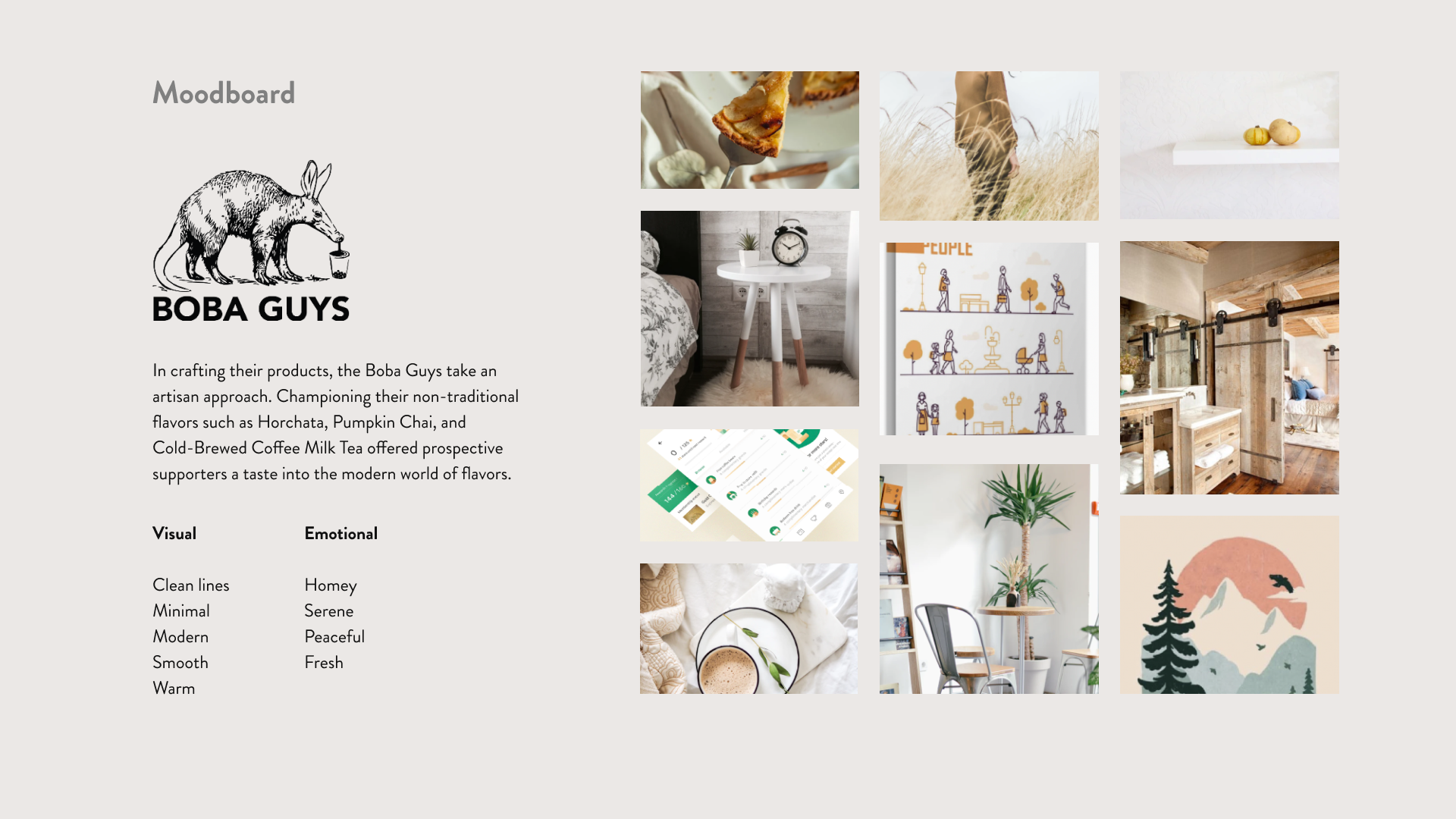
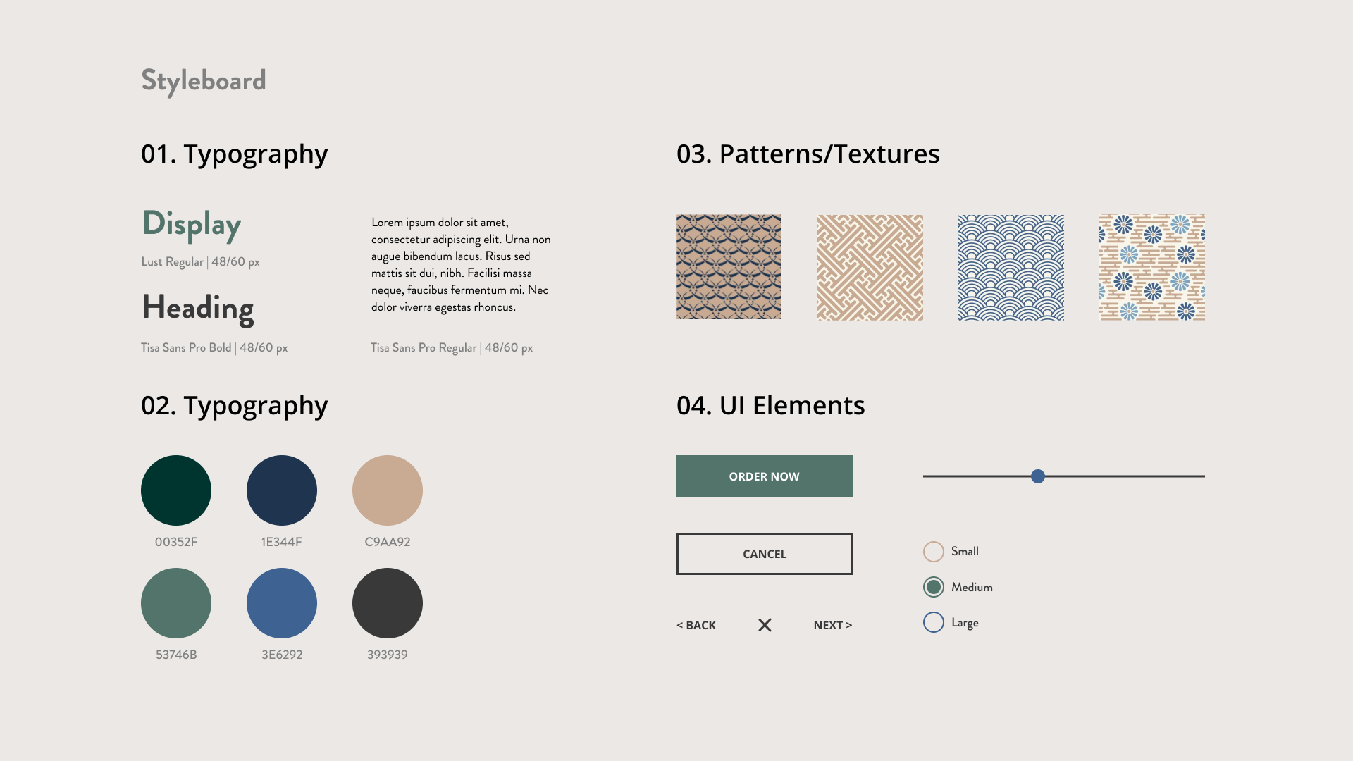
Using the current branding, I devised a moodboard and styleboard to keep the look and feel of my interactions consistent.
SITEMAP
Information Architecture
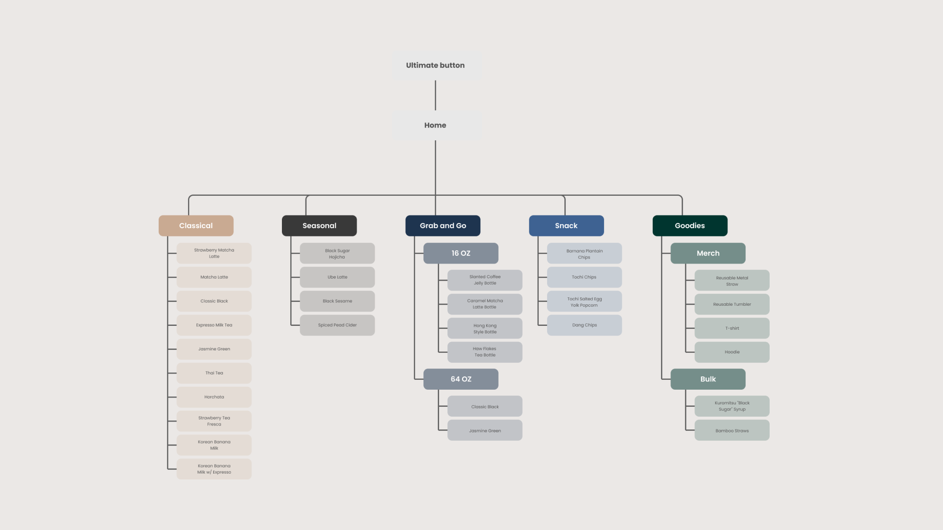
A sitemap is a schematic of a website or program that demonstrates how pages are prioritized, connected, and numbered. If a user flow is like the specifics of a street view, a sitemap is like a blueprint.
Interactions
Button
I wanted to create a simple animation with the hover interaction of the bell ringing as if you were calling a server.
Multi Toggle
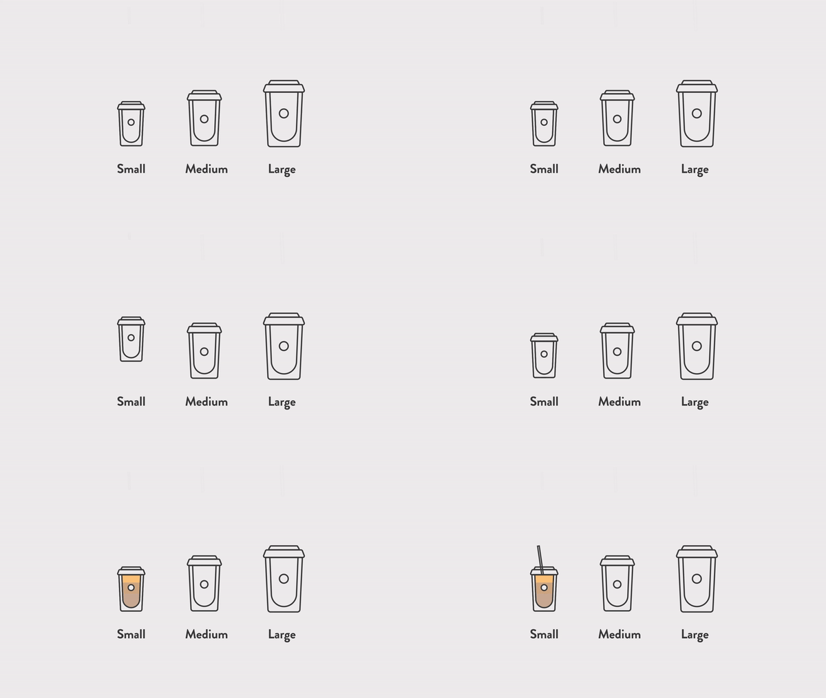
Users will be able to select one of three sizes for their drink. The hover state will float the cup and once it is selected, it will start to fill.
Radio Buttons
being able to select the amount of sugar you want allows users to customize their drinks to their preference. Here only one option at a time is available.


Checkboxes
Users can choose up to 3 toppings which stay selected until clicked again. After the third topping, users can no longer select another topping until one is deselected.
Menu
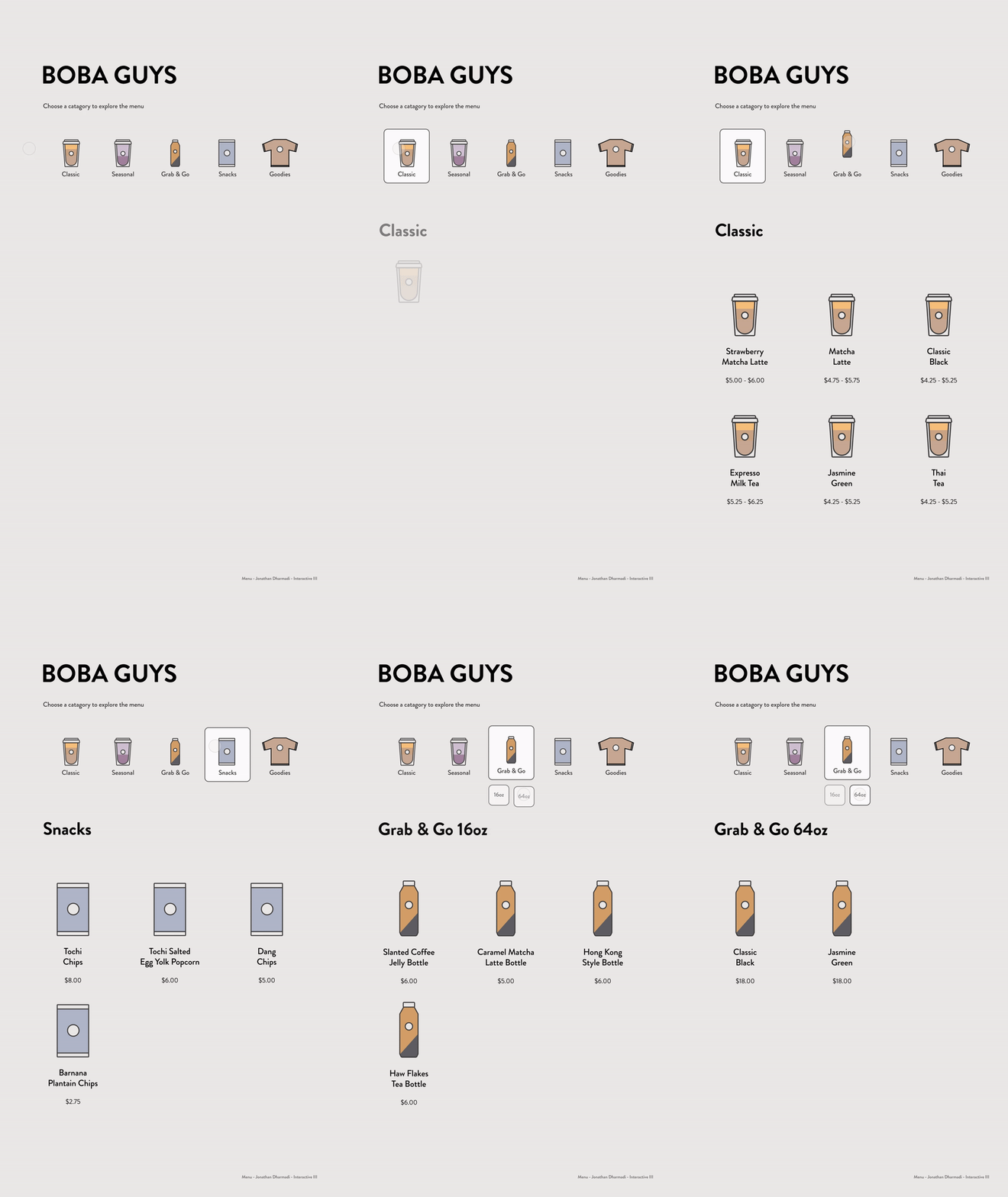
Categories the menu items into sub-categories and utilizes affordances of icons so that it is easily scannable.

Loading
Here, the cup is hovering to ensure that the system is not frozen. The cup fills in conjunction with the percentage and a description shows a fun way to depict the progress.
