DIGITAL ID
Digitalizing Your
Physical Cards
Isn't having everything on your phone just so convenient?
As digital security increases, the opportunity to use our personal, financial, and biometric information via our mobile and wearable devices increases. We are rapidly replacing our physical credit cards, event tickets, boarding passes, and medical records with their respective digital twins.
Role:
Visual Design + UI/UX Design
Duration:
4 Weeks
Software:
Figma + Illustrator
PDF | Preview Avaliable | 44.7MB | 37 pages
THE PROBLEM
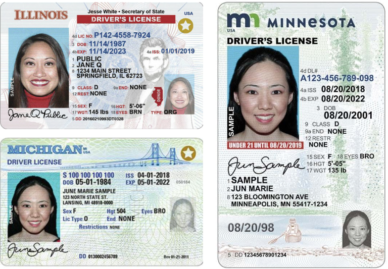
Current physical forms of identification lack readability, typographic hierarchy, and visual style.
Early adopters of Digital IDs replicate the physical IDs’ existing visual design within the mobile environment. How can we streamline ID information to a secure digital platform?
1. Current physical forms of identification and their respective digital twins lack basic design principles causing issues in readability.
2. Current solutions do not provide a way to verify the validity of the digital ID.
USER RESEARCH
Qualitative Interviews Defined my Users and Identified User Needs and Struggles.
I Interviewed a total of eight potential users to gather insight about identification cards. The interviews were completed in 30-minute and attempted to gain an understanding of how people use their ID cards.
What I Learned...
1. Authenticity
Vendors were concerned that the upbringing of digital IDs would make it easier to obtain fake IDs via Photograph.
2. Convenience
Participants liked the convenience of a digital ID and having “one less thing to carry around.”
3. Security
Participants believed that having a digital ID made them a target for virtual identity theft and found comfort in an analog card.
4. Lost Mode
Two participants noted that it would be helpful to provide a lost mode that would display the owner’s ID to be easily returned.
COMPETITIVE ANALYSIS
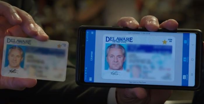
Existing solutions replicate, not transform
Most current solutions allow for three use cases, Law Enforcement, Proof of Age, and TSA check. Although it does the job, It misses the opportunity to take advantage of the digital interface as it physically replicates the original design.
INTERACTION MODELS
Taking a look at what is already out there
I wanted to explore some interaction models that provide similar functionality to what I want to Incorporate in my final design.
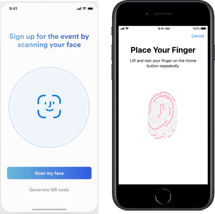
Biometric Authentication
A verification method that uses a biological identifier to authenticate the user. the device authenticates the live biometric data to reference that is registered by the user.
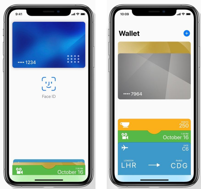
Apple Pay
A contactless secure platform to make purchases in stores, in apps, and on the web. During the process, the user’s information is encoded to protect the user’s private information. In-store purchases use NFC (Near Field Communication).
GOAL
Create a digital ID that streamlines information in a digital platform.
1. Reorganize Information
2. Address Typography
3. Design for convenience
4. Create a Visual Style
5. Explore Interaction Models
INFORMATION ARCHITECTURE
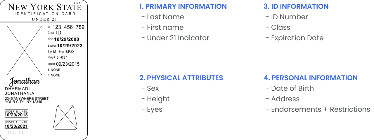
Grouping of information.
It is essential to group information together in order to prevent any confusion. The existing identification lacks such architecture, so my first step was to reorganize the information.
WIREFRAMING
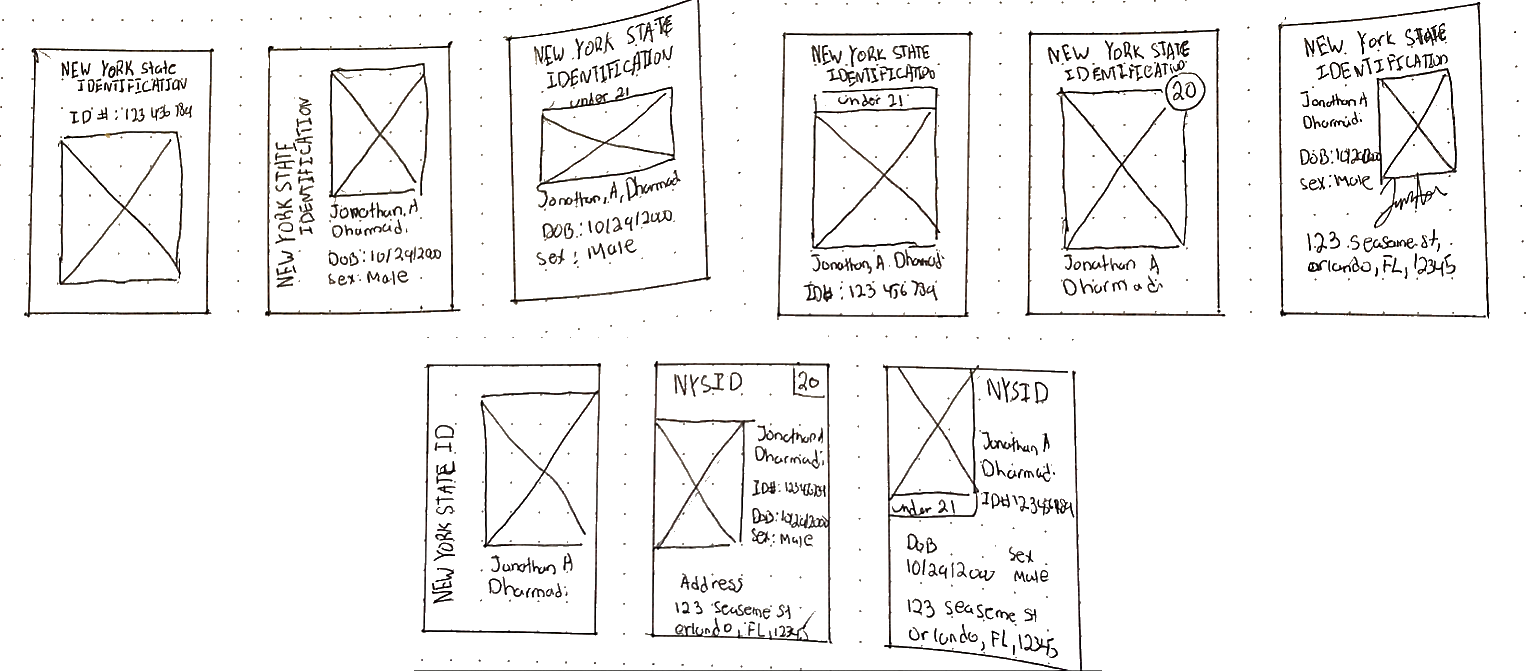
Testing out different layouts
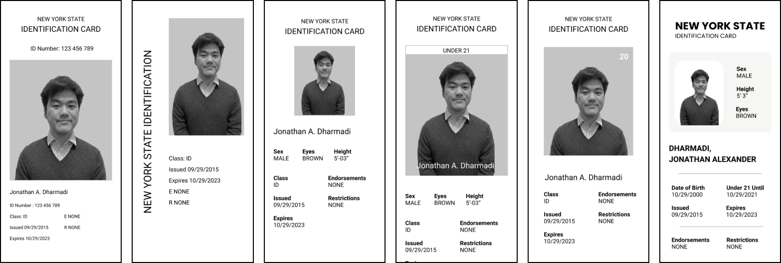
Wireframes allowed me to test out different layouts that I created in my sketches without wasting much time. It showed me the things that worked well and the things I needed to change. My initial wireframes are pretty basic and I started to add more elements as I went on.
VISUAL DIRECTIONS AND ITERATIVE DESIGN
Iterate, Iterate, Iterate
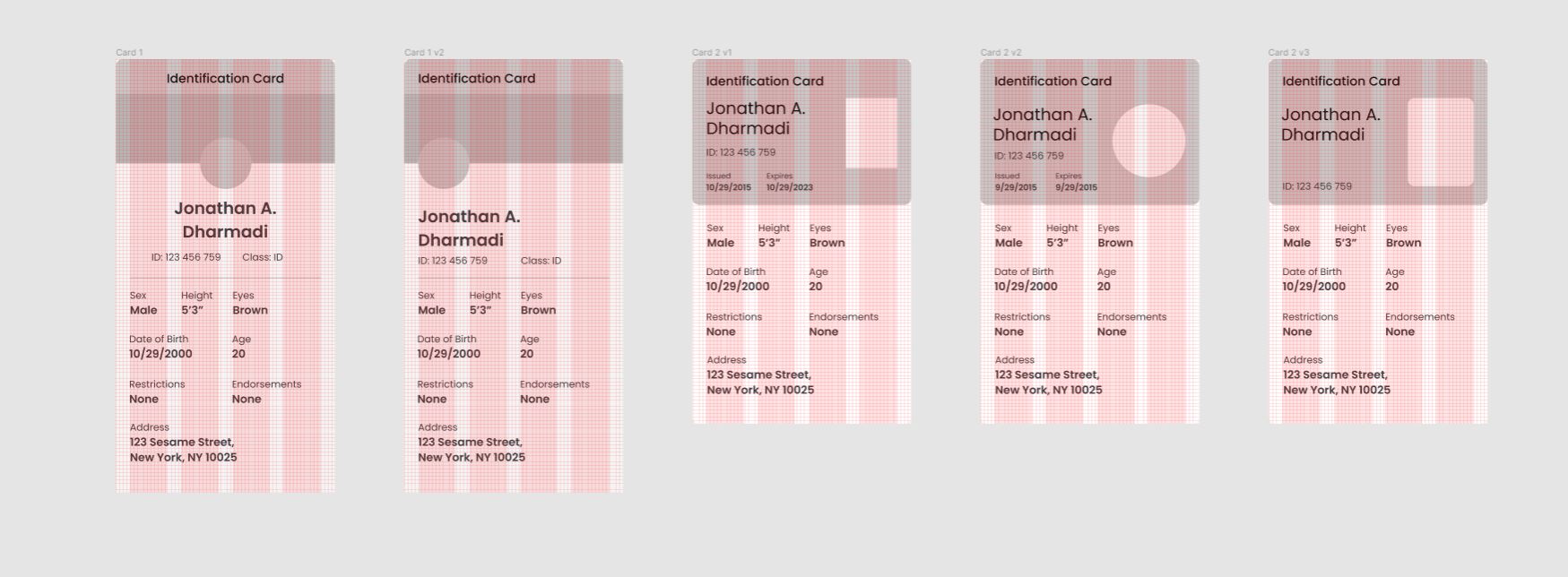
Using my wireframes and mood boards, I created two distinct visual directions. From that, I branched into several iterations attempting to perfect my design every step of the way.
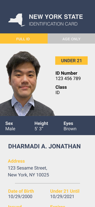
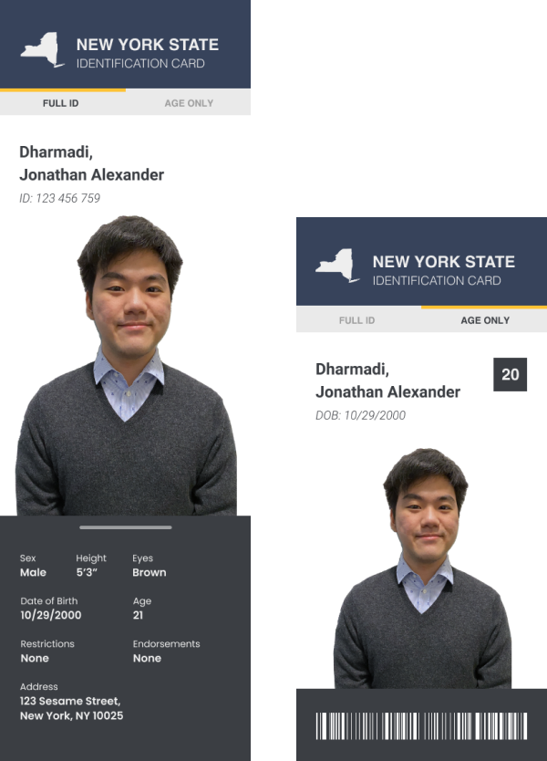
Visual Direction 1
Following one of my wireframes, I laid out all my information and used a Royal color palette of yellow and blue. In the first two versions, there is a lack of hierarchy and grouping. Also, the yellow text was not accessible
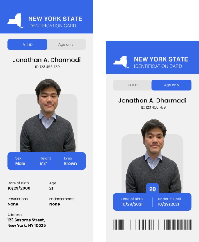
Visual Direction 2
I moved over to a more minimal and fun style for the second Direction with rounded corners and soft blue colors. Information is grouped well together, but there is a lack of information hierarchy as the physical attributes are over-emphasized.
BACK TO THE DRAWING BOARD
Apple pay already had a secure platform that stores credit card information, why not leverage the platform
The apple wallet is quite convenient, it literally is your digital wallet, so why not take advantage of it.
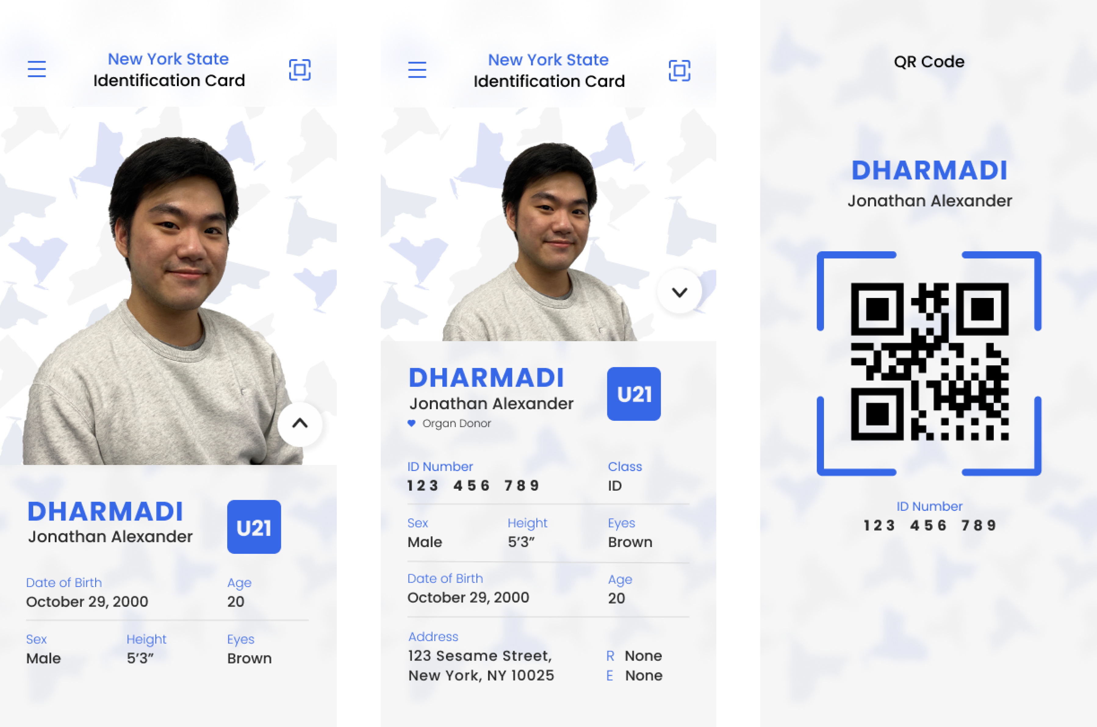
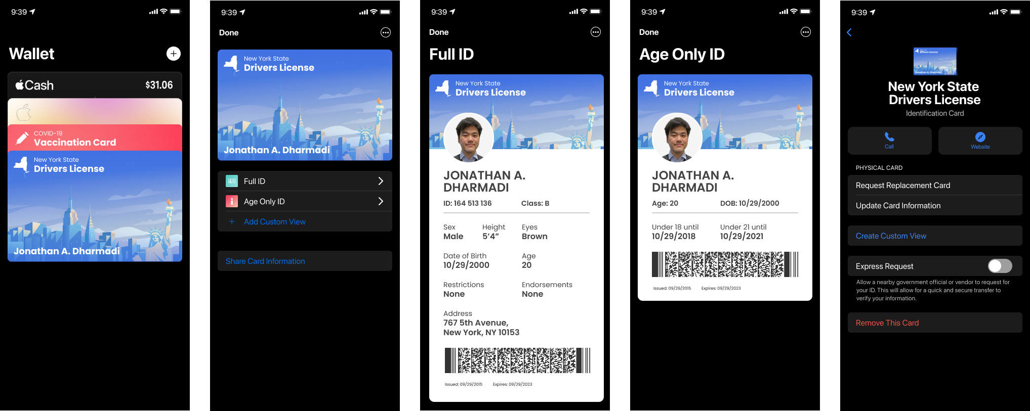
I decided to integrate my design into it the leverage the security and authenticity features that are built into apple's infrastructure. I referenced the apple interface guidelines to layout my design. I realized I had to minimalize it further so it would fit the visual style of the wallet
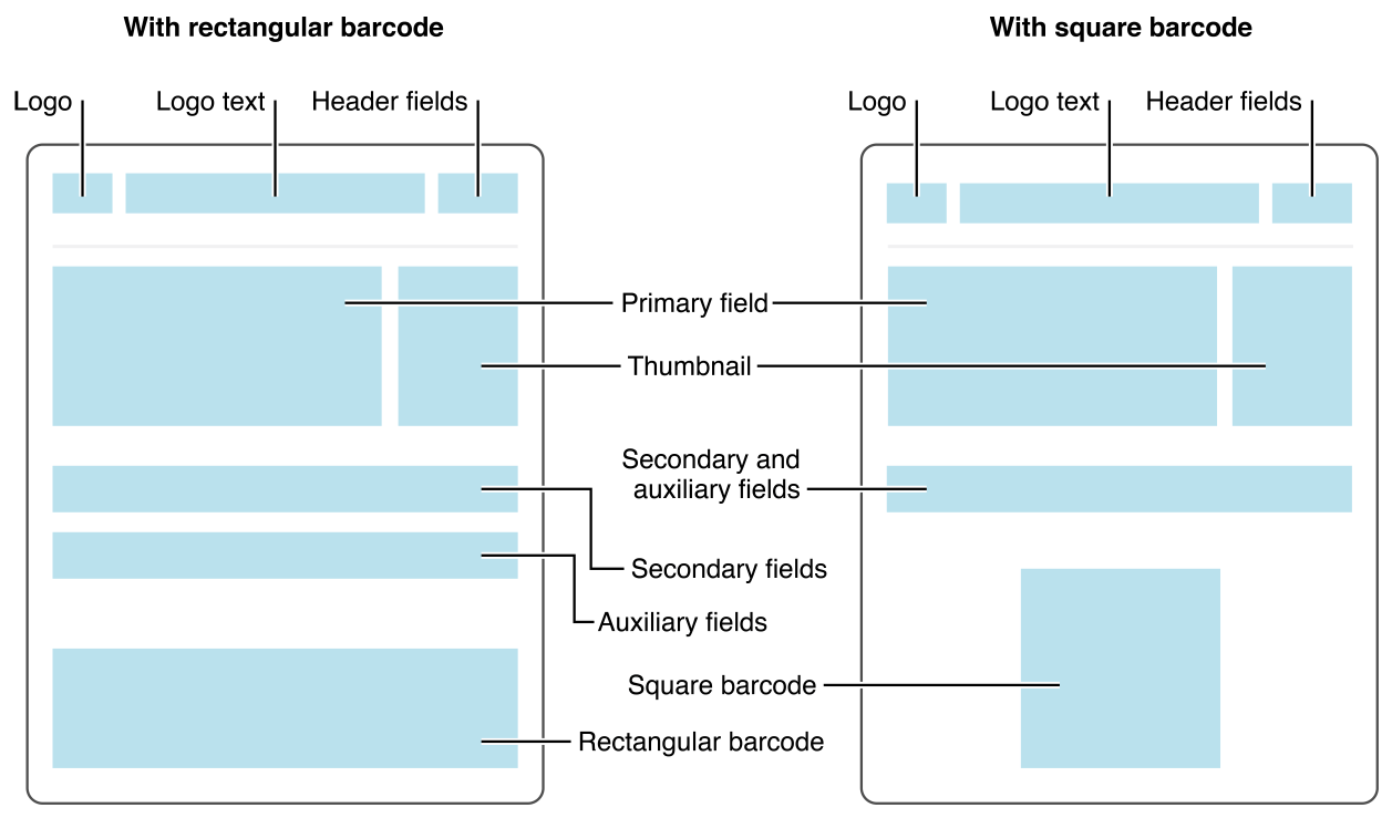
WIREFRAMING v2
Laying out the design based on apple's interface guidelines
I tested with two versions and the first version seemed to be more successful. In these versions, I really wanted to perfect the layout so I implemented a 5px grid system with a four-column grid as I did in my earlier visual designs.
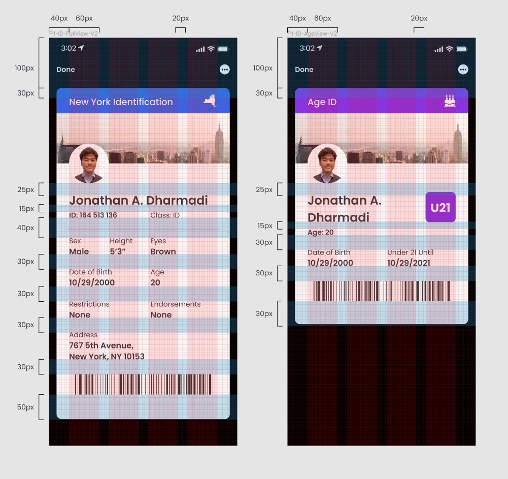
MORE ITERATION
Focused on microspacing
Labeling space between each element helped me to better visualize an even layout. Here the visual design is very simple due to the nature of the apple wallet's design.
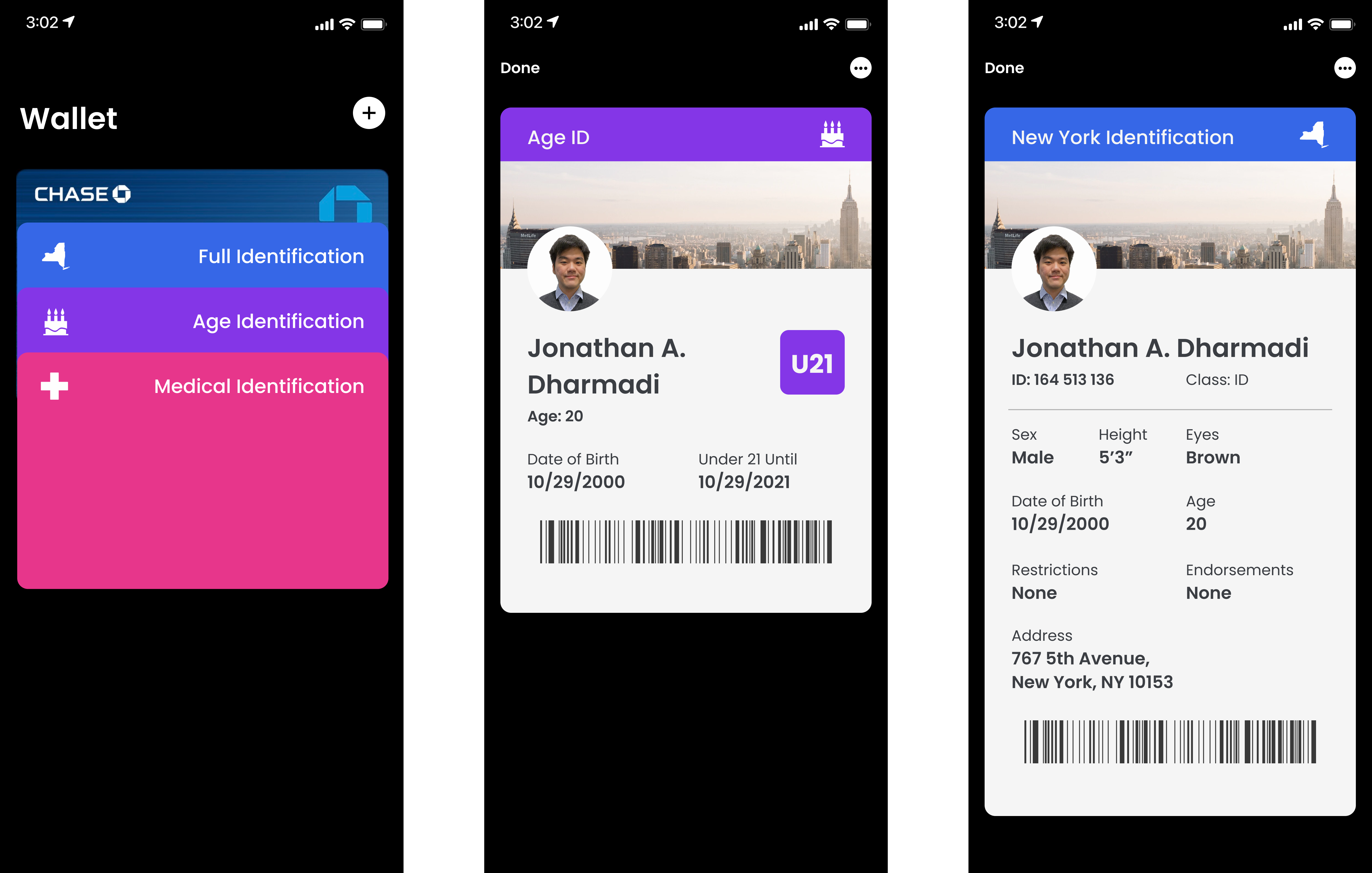
FINAL SOLUTION
Designing the visual identity while keeping the structure
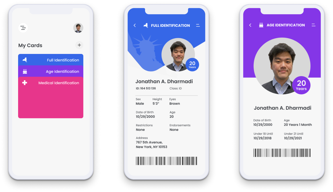
Here my goal was to maintain the grid structure while giving it that visual style. I wanted states to be represented via a high-quality illustration so people are able to take pride in the state that they live in. I further defined user flows focusing on the MVP.
LET'S ADD A LITTLE BIT OF SPICE
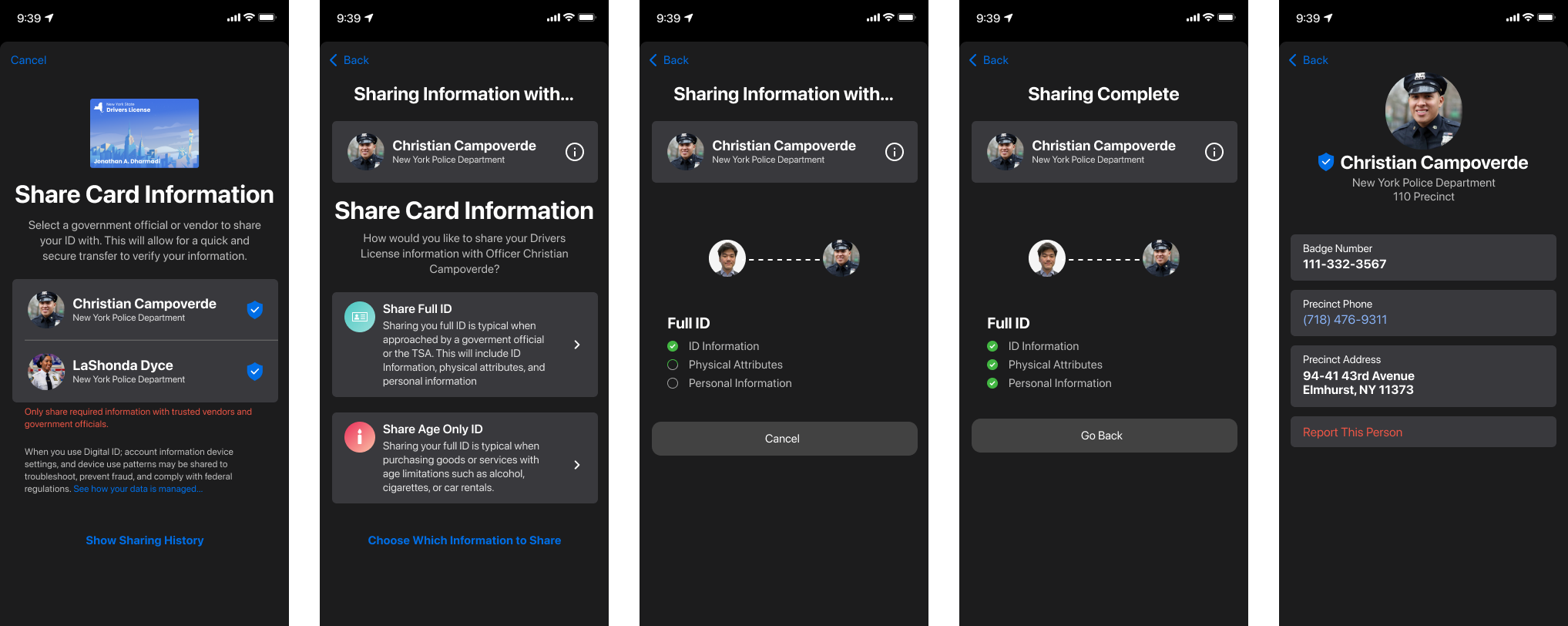
To provide convenience, I added a way to quickly transfer information to government officials or vendors
To get deeper into the ability of the application, I wanted to highlight an extreme user and go through his user flows.
I’m highlighting Warren to showcase the features you would otherwise see. Warren has a rather interesting use case due to his impaired vision and his need to multitask. In this instance, Warren will choose to connect to his TV to satisfy both his needs.
TAKEAWAYS
Honor The Content
There were many things that I wanted to change or get rid of but it was important that I provide the client with what they want.
Try, Try, Again
I stumbled upon many issues and failed many times, but if once you don’t succeed, try, try again. My iterations got better as I went along and I learned a lot!
NEXT STEPS
Prototype & Test
Create an interactive prototype so that I can begin to conduct usability test to continue improving the product
Edge Cases
Design out the interactions for the edge cases to be more inclusive to users who want to utilize the additional features.
